2010年6月9日星期三

Project3-Final Submission

Presentation


PlansSectionsSite & Interior perspectivesRoom Render


MODEL

Narrative: a small-scale compact art shop selling contemporary artwork including paintings and sculptures

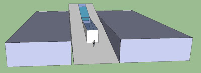
Description: For the small commercial gallery, the key word is "selling". therefore, I want to put the sculpture courtyard in the front so that the passers-by could be attracted and go into it. That idea generate the major character of my galleray- the large box-like, transparent "courtyard" in the frontpart. so when people pass by, they not only see the sculpture in the courtyard, but also see what's happening behind(which is display room). however, the courtyard is 1m high from the ground, so people can't get there directly, they have to come into the gallery, then the aim of "selling" could be possibly achieved.
there are 3 rooms in the gallery: The first one is corridor-like 3m high small room connect the entrance, which only display the small-scale sculptures and paintings; the second one is 4m large room(see my rendering), the paintings are hanging along with a big stairs(platform actually), and the third room is not really room, becaus there's no wall to enclose it, when people stand there, they can look straight or look down.

Feedback from my tutor: the paintings are not usually hanging along with stairs, that is not comfortable to watch them when people moving up. so my problem is there's not enough wall to hang the painting. maybe I could remove the staircase and the small room on second level. and at the sametime cut down the wall of the front courtyard to let the people get a better view.

2010年6月4日星期五

Project3- Further Development


The two main ideas I add to my design this week are: 1. Looking Through (those purple arrows indicate the view)
2. Ceilling Height change

2010年5月28日星期五

Project3- Design Development

I changed my initial ideas.
The commercial gallery is actually a shop, and the aim is to sell.
So why not make it transparent to attract people in? like the Apple stores around the world.
I still want to put the sculpture courtyard in the front, and make it like a transparent box, behind the courtyard, there are display areas. So when people pass by, they can see the sculpture in the courtyard and at the same time, see what is going on in the gallery.

Project3- Artist

Yue Min-jun

contemporary Chinese artist based on Beijing, China. best know for his oil painting depicting himself in various settings, frozen in laughter. he has also reproduced his signiture image in sculpture.


2010年5月27日星期四

Project3- Initial Ideas

FIRST:My first idea is to make the courtyard and the building as a whole, and put the courtyard in the front so that it could become an attraction to the passer-by. So I am thingking to make the building like a big ramp. the first part is cortyard, people can see the sculptures in the courtyard when they move on through the ramp, and then go into this building.


And for the inside display area, I want to put a large podium and the display panels are arranged along with the edges of the podium, when people come in(the entrance is on higher level because of the "ramp courtyard"), they go down by the podium and watch the artwork at the same time.


SECOND: my second idea is derived from the character of the site. because it is like a long sandwich between its adjacent buildings, I want to make something to connect those adjcent buildings, then the picture of shoe-lace and zip occurs in my mind, they are the stuffs to connect the adjacent parts:

so the appearence of my art gallery could be like this:

Project3- Precedent Art Gallery in 2 Danks St

Those galleries are all small-scale commercial galleries assembling together, each of them is operated by a dealer to sell one or two artists' works:

PLAN
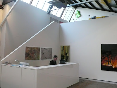
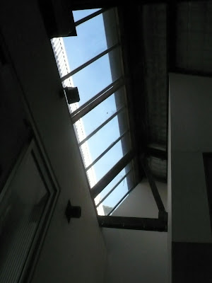
THE SKYLIGHT in GALLERY

This gallery has two storeys, The second one is the dealer's office and workshop and private space.

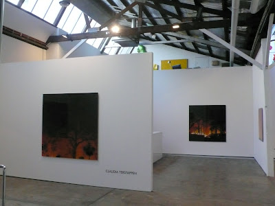
The celling, the daylight, the artificial lighting and the display arrangement in one of those galleries. It is very simple(and not very nice-looking)


Another arrangement


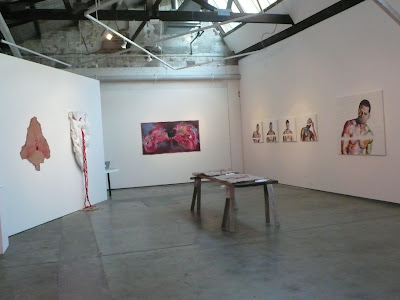
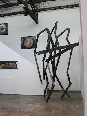
The space to put a large scale sculpture (the sculpture has been put in front of a staircase, which indicates that the upstair is private space, stop walking)


This is the space to deal with the small-scale sculptures


The small working space for the dealer just behind the display panel (sometims, the office "room" is not necessary)


This is a very tiny kitchen in the gallery, just enough for making a cup of tea or a sandwich (but I think it's pretty enough for both dealer and customers)


The compact sliding stock area for paintings


Overall, those real art galleries are simple in design, no damatic circulation or stunning architectonic looking. but they are bright , comfortble and straightforward telling people what they are selling.